Design Year Book |
| A’ Design Awards & Competition – Winners of A’ Package Design Awards Posted: 31 Dec 2014 07:17 AM PST 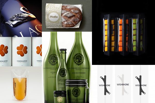 A' Design Award & Competition is the Worlds' largest annual juried design competition honours best designers, architects, and design oriented companies worldwide. Every year, projects ranging from industrial design to architecture that focus on innovation, technology, design and creativity are awarded with the A' Award to push them further for success. Winning and having the A' Design Award & Competition is a recognition of excellence for designers and a proof of quality for companies. Featuring 15 best works for A' Package Design Awards: 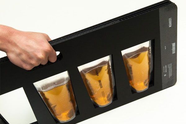 1. Leuven Beer Packaging by Wonchan Lee for Minimalist, Platinum A' Design Award Winner for Packaging Design Category in 2013. This simple carrying pack have two panels of velcros holding the ice bag beers securely when closed and the interesting part of this carrying pack is it can be opened flat to access the ice bag beers. 'Differentiation is probably the most important factor in packaging these days. "An ice bag" clearly is a new approach and concept for beer packaging: not breakable, costs less to produce, lighter to carry, therefore advantage in delivery and production. From brainstorming to branding, choosing materials and finishing, the solution differentiates itself from other premium Belgian beer competitors in the market.'  2. Patakukkonen Rye Pie Innovative merchandising of packaging by PACKLAB, Platinum A' Design Award Winner for Packaging Design Category in 2013. Patakukkonen is a Finnish traditional oven baked kukko (pie) made from regional ingredients. Based on a young boyʼs memory of his grandmotherʼs cooking, the brief was to develop an unique and modern brand based on traditional values, exploring classic Finnish foods. For PACKLAB, this is an inspiring creative yet challenging opportunity due to the product would be showcased from small cafes to major retailers. The verdict: the packaging had to work and presentable equally in low counter refrigerators, high-standing door refrigerators of convenience stores, and even promotion refrigerators found in upscale food courts and airport food stores. 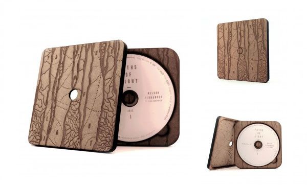 3. Paths of Light Dvd Box by Francisco Elias & Nelson Fernandes, Platinum A' Design Award Winner for Packaging Design Category in 2013. "Paths of Light" is a short animation by Nelson Fernandes Aka Zina Caramelo (Visual artist). The packaging looks like it was plucked from the woods and moulded to form a DVD. Using a single wooden plank on which he reinvented/unrolled all his visual and poetic discourse with multiple techniques. This life cycle resulted in a box, whose construction involved two distinct stages, the first stage - the mechanical one - involved cutting and laser printing operations (1 hour and 30 minutes) to produce 6 different pieces and the last stage - the manual one - involved the exploration of collage techniques using those 6 pieces, a drying period and a sandpaper finishing to create the final version. Each box is unique. 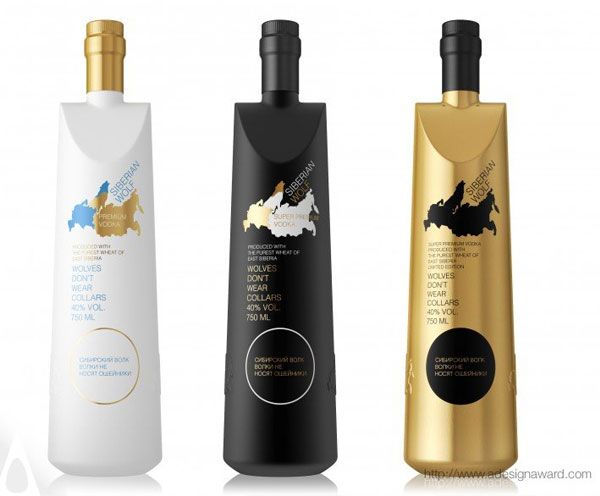 4. Siberian Wolf Vodka Bottle by Guilherme Jardim, Golden A' Design Award Winner for Packaging Design Category in 2013. Inspired by siberian nature and simplicity, the elegantly shape bottle that meant to express feeling of modern Russia aim to appeal to young Vodka consumer with its premium edition (white), a super premium edition (black) and a limited edition (gold). 'In one color you can see the western part of Russia and in other color you can see the siberian part. The wolf is present on the top of the map. The slogan is "Wolves don't wear collars", appealing to freedom, to the young customer.' 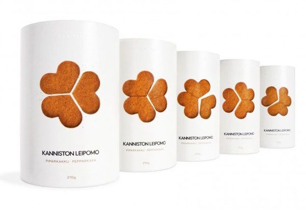 5. Kanniston Gingerbread Biscuits Product-Packaging Innovation by PACKLAB, Golden A' Design Award Winner for Packaging Design Category in 2013. 'Kanniston Leipomo (Bakery) asked the help of PACKLAB to redefine Scandinavian premium gingerbread for Christmas. The brief was to design packaging for simply the best Gingerbread cookies in Finland.' With that, Packlab redesigned the products from the cookies itself to the packaging by looking into the stakeholders behaviour within the bakery distribution chain, retail environments and explored Scandinavian seasonal home experiences. The outcome a marriage of old Scandinavian tradition of three pieces heart-shaped gingerbread that brings good luck and emphasizing the affectionate characteristics of the season. 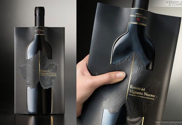 6. Rosso Del Vigneto Nuovo Wine Pouch by Reverse Innovation for Gigante, Golden A' Design Award Winner for Packaging Design Category in 2013. The challenge for Reverse Innovation and the winemakers GIGANTE was: how to overcome the negative image of wine sold in pouches or as a "bag in a box", which is often synonymous with poor quality, especially in Europe? Reverse Innovation managed to come out with an innovative design that cleverly and elegantly reinterprets the classic "Bordeaux" bottle. A simple and black pouch is wrapped by a self-standing paper rigid structure that helps to define the elegant and sophisticated shape of the final product. 'The geographical origin of the grape is enhanced by the use of blind embossing and UV varnish to reproduce the distinctive terracing of the vineyard. The naturally irregular but almost concentric patterns recall the rows of vines growing on softly undulating slopes. The illustration of the vineyard location even uses the specific shape of the local vine leaf, which is characteristic of this splendid wine-producing area.' 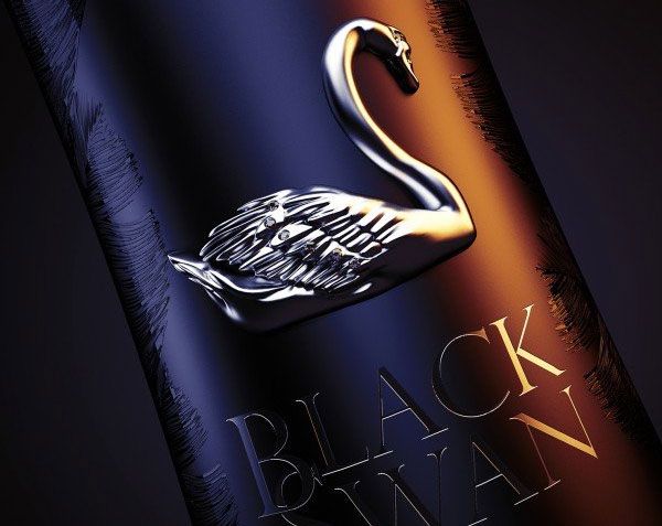 7. BlackSwan Premium Vodka with the jewelry by Vladimir N. Bratchenko for WaldemarArt, Silver A' Design Award Winner for Packaging Design Category in 2013. 'Well.. I was in the zoo once and saw a black swan . I was very stunned because it was so beautiful and I was very inspired by it and So.. Then I thought to make an elegant design for Vodka using its image.' This premium Vodka with the jewelry with its silhouette of the bottle that resembles the shape of a slender girl decorated with jewelry in the form of a graceful swan encrusted with Swarovski crystals while its surface is covered with a pattern in the form of swan feathers, creating a complete image of an elegant Black Swan. 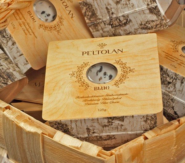 8. Peltolan Blue Cheese Innovative brand and packaging design by Packlab, Silver A' Design Award Winner for Packaging Design Category in 2013. 'Slice of nature, slice of wood and a slice of cheese - the key inspiration was the Finnish nature and obvious cultural traits of forests, chopping wood and sauna.' With this as inspiration, the ''Slice of Finnish Nature'' was a narrative taken literally and transferred to the stackable structure that forms a birch tree – an approach which offers impressive merchandising opportunities, instantly differentiating the brand. The front of the packaging communicates natural refined wood which suggests the refinement of the cheese making process thus, giving this no brand identity a complete make-over from its previous shrink wrapped and labeled with a barcode sticker. 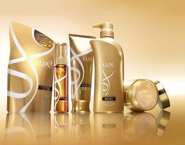 9. Lux re-launch Haircare range by JDO Brand Design & Innovation, Silver A' Design Award Winner for Packaging Design Category in 2013. The challenge: their packs need to really standout within the absolute chaos on shelf. 'By taking the strong equity of the LUX brand identity, JDO created a new and highly animated device by way of the ribbons marque. The gold ribbons reflect pure glamour, ooze confidence and luxury and are both bold and impactful. The two sub ranges of Shine and Damage Repair are easily differentiated through the base pack colour with pink and bronze highlights. On shelf the LUX range combats the clutter with an elegant and refined presence.' 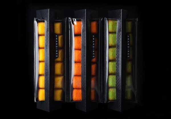 10. Amandines Biscuits Packaging Product-Packaging Integration by PACKLAB, Bronze A' Design Award Winner for Packaging Design Category in 2013. Packlab designs enabled the simple Amandines biscuit to be considered as a premium French products with their simple effective use of carton material has enabled the product to be merchandised in three different ways: a) to stand upright and proud for the retail environments; b) to stand on its side to be slightly more submissive in smaller retail environments; c) to lay naturally on its back on table ready to be shared 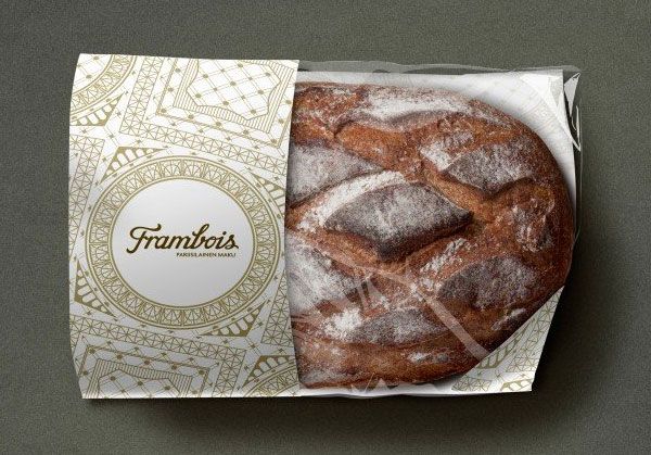 11. Frambois Bread Brand and Packaging Design Excellence by PACKLAB, Bronze A' Design Award Winner for Packaging Design Category in 2013. Inspired by Paris and its architecture, with a lot of the reference taken from Midnight in Paris, an American 2011 romantic comedy fantasy film written and directed by Woody Allen, Packlab created a simple yet outstanding packaging with tones, colour and lines that illustrate a sense of subtle authority and Parisian lifestyle. The new packaging itself is able to keep the daily baked warm and fresh too.  12. Wishbone Product-Packaging by PACKLAB, Bronze A' Design Award Winner for Packaging Design Category in 2013. The most attractive part about this packaging is the product appears floating effortlessly. Through visual impact, Packlab successfully elevating a product in its packaging design where the intelligent one-piece structure folds in on itself and the diecut hole provides an inner slot mechanism that holds the product in place. The one-piece structure continues to fold in on itself and eventually locks to create a pack that resembles a display case.  13. Les Verges de L'Empereur Branding & Containers by Rebeka Bahadorani for Les Vergers de l'Empereur, Bronze A' Design Award Winner for Packaging Design Category in 2013. Inspired by 17th century art & crafts, this product has a range of different containers for several different products related to an apple plantation, such as, apple juice, stewed apple, Cidre, and cosmetics (pomotherapie), as the plantation is located in the battle field of Waterloo - Belgium, more precisely at the Emperor's personal guards. The products accent was also put on natural, ecological and organic qualities of this plantation, by using simple and natural materials.  14. Xin Lin Tea House Tea Package by Shaobin Lin for Xin Lin Tea House, Bronze A' Design Award Winner for Packaging Design Category in 2013. With the concept derived from carved wooden screen and window grilles which have most Chaoshan characteristics, this packaging also has many fonts and graphics that relates to Chaoshan culture and Gongfu tea.  15. Abstraire Artisan Cheese by Jia-Ru Lin for Abstraire, A' Design Award Winner for Packaging Design Category in 2013. Inspired by the nature and fresh dairies, the geometrical shapes and 3D figures gave the packaging a modern and clean feels. The brand design managed to targets cheese foodies to experience high-end artisan delicacies with colors that clearly feature three different types of cheese: blue represents bleu d'Auvergne from cow, yellow represents crottin de chavignol from goat, and pink represents tome au marc from sheep. This helps consumers to distinguish different types of cheese. Stay tune with us for our upcoming post on A' Architecture Design Awards. Click here to learn more of A' Package Design Awards and A' Design Awards. |
| You are subscribed to email updates from Design Year Book To stop receiving these emails, you may unsubscribe now. | Email delivery powered by Google |
| Google Inc., 1600 Amphitheatre Parkway, Mountain View, CA 94043, United States | |